Liquid Glass: using Apple's new iOS 26 design language well
iOS 26's Liquid Glass is the biggest visual shift since iOS 7. Reserve it for the navigation layer, and never ship it without the accessibility gates.
5 min read
Liquid Glass is the biggest change to how iOS apps look since iOS 7 - and as of 2026 it's no longer optional to reckon with. Since April 28, 2026, every new App Store submission and update must build against the iOS 26 SDK, which means your app renders in the new design language whether you designed for it or not. The good news: used well, Liquid Glass makes an app feel modern and deliberate. The trap: it's very easy to overuse, and shipping it without honoring accessibility settings quietly breaks the app for the people who need those settings most. The whole skill is knowing where glass belongs - and where it absolutely doesn't.
What Liquid Glass actually is
Liquid Glass isn't a blur filter or a color. In iOS 26 Apple formalized it as a first-class dynamic material - a digital "glass" that simulates translucency, refraction, depth, and response to movement, and it ships with real SwiftUI APIs: glassEffect(), GlassEffectContainer, and glassEffectID for morphing connected elements. There are two variants: .regular for toolbars, tab bars, and standard controls, and .clear for small floating controls sitting over photos or maps.
The reason it matters for product quality isn't the shininess. It's that Apple has drawn a clear line about where it goes, and getting that line right is the difference between an app that feels native in 2026 and one that feels noisy and hard to read.
The one rule: glass floats on the navigation layer
Apple's guidance is unusually direct: "Liquid Glass is best reserved for the navigation layer that floats above the content of your app."
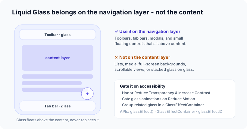
Think in two layers. The content layer - your lists, text, media, the actual substance - stays solid and legible. A thin navigation layer of glass floats above it: the toolbar, the tab bar, modals, and small floating controls. That floating glass creates depth and focus without obscuring what the user came for.
What to keep glass off of, per Apple's own "avoid" list: content layers (lists, tables, media), full-screen backgrounds, scrollable content, and - importantly - stacked glass on glass. (Glass can't sample other glass, which is why related glass elements should be grouped in a single GlassEffectContainer.) The failure mode is putting glass on everything: the screen turns into a hall of mirrors, contrast collapses, and nothing reads.
The part most apps get wrong: accessibility
This is the line we'd underline twice. Liquid Glass is translucent and animated by default, and both of those are accessibility hazards if you don't handle them.
- Reduce Transparency - users can turn translucency down so text over glass stays readable (Apple even added a dedicated transparency control in iOS 26.1 after early feedback). Your custom glass surfaces need to respond to it, not fight it.
- Increase Contrast - glass should get more opaque and better-separated when this is on.
- Reduce Motion - glass animations (the refraction, the morphing) should be gated on
accessibilityReduceMotion. Don't ship a glass animation that always runs.
Liquid Glass is not a fixed look anymore - the user can tone it down, and a well-built app respects that. If your interface only works at full transparency, it isn't finished.
Our opinion
Our take: Liquid Glass is a genuine upgrade when used with restraint, and a liability when used as decoration. The teams who'll get it right are the ones who treat Apple's "navigation layer only" guidance as a hard rule, not a suggestion - glass on the chrome, solid legible surfaces for the content. Reach for it on the toolbar and the tab bar; leave it off the reading experience.
And we'd put accessibility ahead of the aesthetic every time. A beautiful glass effect that becomes unreadable with Reduce Transparency on is not a beautiful effect - it's a bug that ships to exactly the users who can least afford it. This is the same principle behind everything we build: the interface has to work for the person using it first. Test your app with Reduce Transparency, Increase Contrast, and Reduce Motion all switched on before you fall in love with the glass.
The pragmatic reality for existing apps: because the iOS 26 SDK is now mandatory, standard system controls already adopt Liquid Glass for you. That's mostly a gift - you get the modern look on navigation bars and tab bars for free. The work is auditing where the system applied it, toning down anywhere it hurts legibility, and adding custom glass only on the few surfaces that genuinely benefit.
How Ashvara helps
We build iOS apps in SwiftUI, and adopting a new design language well is exactly the kind of craft-and-restraint work we do - applying Liquid Glass where it earns its place, keeping content legible, and gating every effect on the accessibility settings so the app holds up for everyone. It's the same care we bring to shipping private, on-device features and App Store submissions that go smoothly.
If you have an iOS app that needs to feel current on iOS 26 - or a new one to build right from the start - that's our iOS development work. Tell us about it and we'll make it modern without making it unreadable.
Sources: Apple Developer - Glass (SwiftUI) and Applying Liquid Glass to custom views; SwiftUI Liquid Glass guide; iOS 26.1 transparency control (TechCrunch).